|
|
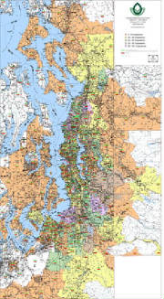
Need demographic data represented in a
clear and coherent manner on an easy-to-ready map? Many of our clients turn to us to represent their information with
color values by ZIP Code to reflect data such as employee, client, and/or sales densities. The advantage of using
our mapping lies in our ability to craft a map graphic that uses our proven mapping, that reflects clearly and accurately,
your information.
|
|
At Kroll we recognize that there are
numerous approaches to displaying your data. We can help you decide which method best conveys your information, whether
it is the data base driven GIS approach, or the use of our traditional digital cartography with custom overlays.
|
|
|
|
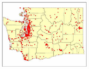
At first glance, this Washington State map
might appear to be a very simple graphic, however the red dots represent thousands of locations that were batch processed
from a spreadsheet. These dots represent locations that would be effected by a State ballot issues. The regeneration
of these points was animated and incorporated into television commercials that supported a view on a State ballot initiative.
|
|
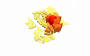
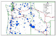
Turn your spreadsheets into maps! This
example demonstrates a "scaled - symbol" approach to the display of clients per town/city. This map took only
minutes to generate and displays tabular information geographically, and with symbols that allow for easy identification of
the locations with the highest and lowest client counts.
|
|